Case Study: Chelsey Home
An Award-Winning
Online Interior Design Studio
Project Background
Chelsey Home is an award-winning Online Interior Design Studio that focuses on designing functional and holistic spaces. With her minimal and timeless style, founder Chelsey Preuss combines natural aesthetics and high quality permanent pieces to create functional spaces that promote intentional living and inspire overall wellbeing.
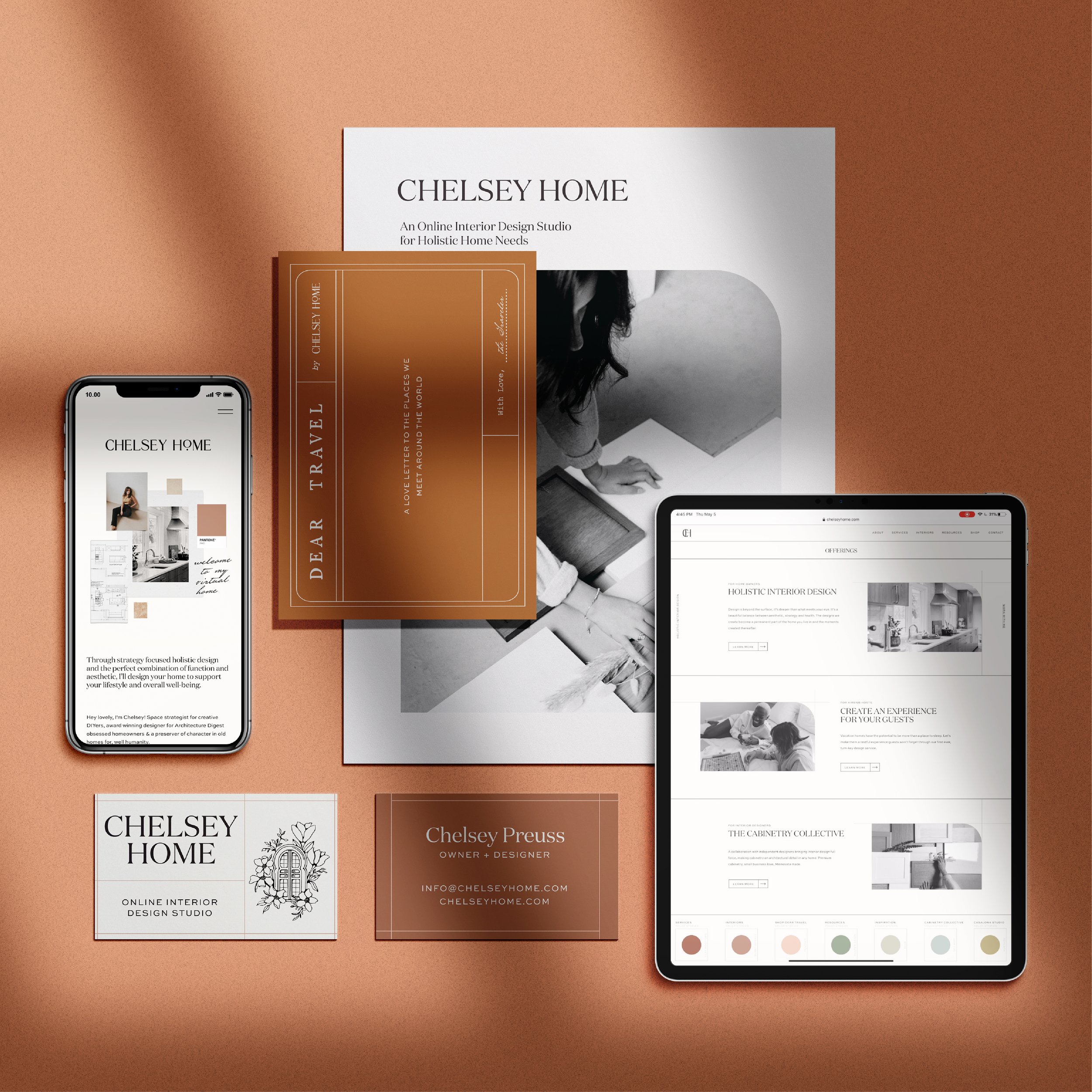
Our mission was to create a compelling visual identity that unified and communicated the various areas of the Chelsey Home brand, as well as elevating her digital presence as an online service provider.
The Chelsey Home brand is, first and foremost, an online interior design studio, but we had the added challenge of developing multiple sub-categories of her business, including a community for other industry service providers, Chelsey Home’s rental studio, and a small home goods shop.
The Brand
Early on in the project, we decided to differentiate between the different areas of her business through color, choosing monochromatic families for each category: orange hues for the primary brand, evoking feelings of warmth and friendliness; mustard for the vacation rental, and blue hues for The Cabinetry Collective community.
Knowing how we would be using the colors early on allowed us to intentionally plan for the brand photoshoot, coordinating monochromatic outfits and props.
Reflecting the concept of color stories in the interior design industry, and mirroring the look of paint swatches, we created a secondary navigation for the website indicating the new color palette.
The Design
Throughout the identity, we used an elegant uppercase typeface paired with a traditional typewriter font, balancing the high-quality of service she offers with her personal approach to restoring older homes.
Using a series of lines throughout every design, we developed a consistent look for the visual identity that mimics the architectural renderings familiar in the interior design industry. Using lines as a design element adds a modern feel to the Chelsey Home brand, symbolizing the modern elements she brings through newfound functionality to the character homes she designs for.
With a minimal approach to the website design, we allowed Chelsey’s work to speak for itself. We wanted to create a structured grid system, with white space that allowed each element the space to breathe.
Creativity is elemental to designing homes, and using monochromatic color palettes, motion elements, staggered images reflective of both her structure and flexibility in design, and mood-boards throughout the site we embodied that creativity. These mood-boards are not only a unique way to display her work and images, but also mirror interior design style boards presented to each new client.
Want to see more images from this project? Check it out in our portfolio.
Are you ready to level-up your branding?
Check out our services to see how we can work together, and let’s have a chat to evaluate the problems you’re currently facing in business and how your branding might be falling short, so we can create a plan for your business and brand moving forward. Our goal is to create a beautiful brand that solves your problems and serves your business better.
Interested in working together on your brand? Reach out via our Client Application form below. :)


